History and prerequisites
The iPod nano 3G has come to replace the popular second generation on September 5, 2007. Steve Jobs, Apple CEO, demonstrated a lot of new products at that presentation -- iPod touch, new iPod classic, iTunes Wi-Fi Music Store. Besides, he broke the news about dropping prices for the
8 GB iPhone to $399 (and discontinuing the 4 GB modification) and impressed Americans with his cooperation with Starbucks. Along with this news, he certainly paid attention to iPod nano 3G.
According to Steve Jobs, owners of the iPod nano badly wanted two features: video playback and games. The second point was hardly the reason to design a new product, but video playback is indeed important for users and Apple. The more video playback devices the market offers, the more video content will be sold by iTunes Store. So Apple will get more profits and expand its influence to film studios. The more sales, the more conditions
Apple can dictate. Common users will also benefit from the new feature.

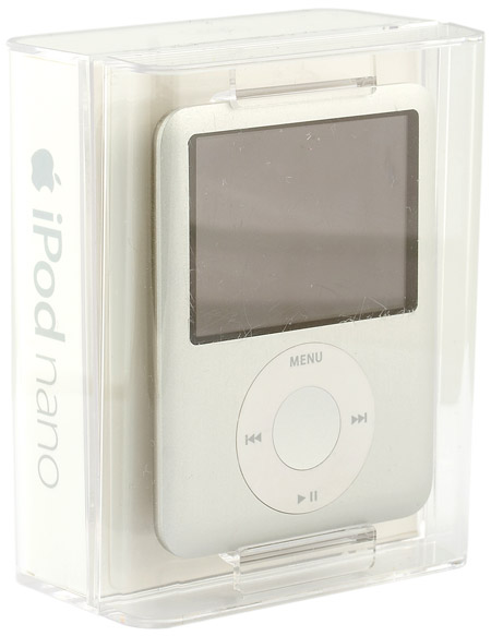
When we saw a photo of the iPod nano 3G for the first time, we had an impression that the player became much larger. It can be explained with the position and size of the traditional click wheel -- this wheel was almost as wide as the device itself in previous models, but now there is
plenty of space at the sides, which creates an illusion of a wider player. We understand why Apple enlarged the player -- you need a large display for more or less acceptable playback. As the concept and controls of the player remain the same, it has to be made wider. But we shouldn't forget that the new product is much lower than the iPod nano 2G. So when you take the new player in your hands, if will feel strange, but you won't find it much
larger. Dimensions: 69.8 x 52.3 x 6.5 mm, weight: 49.2 g.
Impressions
So the modified dimensions and proportions with the volume preserved is the first thing that we paid attention to. Another thing that attracted our attention is ergonomics. The click wheel went down practically to the bottom of the player, so you have to bend your thumb, which is inconvenient. That's why you want to hold the lower part of the player, and if you do, there are more chances to drop it. These ergonomic issues are not serious, some people may even fail to notice them, others will easily get used to them. However, the player still has them.

When we switched the player on, we noticed two aspects -- a crisp display and a new interface. Let's start with the first aspect. We should give Apple its due -- the company not just added video support, the player is equipped with a high quality QVGA display, 320x240. The large iPod classic uses the same resolution. Besides, most video podcasts are also distributed in QVGA format. The pixel density of the 2-inch display is 204 ppi, the highest among all Apple products.
 The
bottom houses the Hold button, the data cable connector, and the headphone interface. The
bottom houses the Hold button, the data cable connector, and the headphone interface.
Write a comment below. No registration needed!
|
|
 |
|
|
|


