 |
||
|
||
| ||
NEC abandoned the 1960 series models in November 2004 and replaced them with the 1970. NEC 1960NXi was also blacklisted, this model had been used in our test lab as an average sample. That's why we were very interested in how good the replacement from the Japanese company would be – the 1970NX. Will the new product carry on the best traditions of the previous model? Test MethodThe test consists of three parts:
IntroductionWe expected to get the 1970NX in November, but we laid our hands on it right on the New Year's Eve. So we were forced to adjourn the real contact till the first working days after the long winter holidays. So, what is the 1970NX? It's a monitor with a totally renewed case, completely new menu (both appearance and content), plus a built-in USB-hub (Northern American market only). Let's go into details...
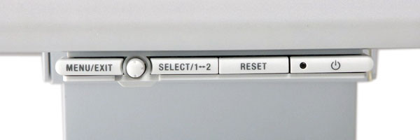
The new plastic case has become noticeably thinner and lighter. Nothing is left of the former greatness of the 1960NXi, many users may sigh in relief. But the special quality of last year's LCD models from NEC has also gone to history. 1970NX case is made of thin plastic and it's not as stable as its predecessor. The round stand takes up more room depthward, but it lacks convenient niches for some unknown reason. The height adjustment remained convenient and retained its large range. But the lid on the back of the pillar, which has to cover cables, now has spews and is hard to remove. Modified menu is a truly revolutional step for NEC. The Japanese were on the bit of spirit of the times, they not only reduced the number of buttons but also introduced a joystick instead of arrow buttons. Now there are only four buttons:
The buttons offer a large backlash, though they are quiet and operate with positive action. But the joystick has already become an object of controversy, where we can add our own arguments: it's really more convenient and simpler than the four buttons, when you are using it unhurriedly. But if you are in a hurry... The 1970NX has every prospect to hear a lot of unpleasanteries.  The settings menu looks like nothing in modern NEC history: it's a graphics interface resembling Windows with the main menu in the center. Each menu section pops up a text sub menu with options-parameters. To adjust a parameter, you select it. On the whole one can say that this menu structure is logical and intuitive. Speaking of ergonomics, all the old gripes have become history together with the 1960. Now you only have to press a joystick and adjust the necessary option nice and easy. When you are finished, just press the neighbouring Exit button. The joystick is absolutely enough for most functions (except for service functions, e.g. reset to factory defaults)! Actually, it's the most convenient interface we've ever seen. Menu buttons do not look perfect in terms of design, but everything's in its place. As it has been already mentioned, unfortunately the European 1970NX lacks the built-in USB-hub. Another pity – it still has no DVI cable in its bundle. This disappointment reminds of the 1960NXi and just proves the low end character of the new model. This is also corroborated by only one DVI connector on the rear panel, though the 1980SXi has two of them. Besides it nicely allows to pivot the display. 1970NX is based on the same 25ms S-IPS LG.Philips matrix, that was used in the 1960NXi. We know its features well, however there already appeared a new version of this matrix with 20ms access time. And actually we could expect this matrix to be used in the new LCD. Nothing of the kind happened. So we have to wait for the EIZO L797, which will use it. We decided to check whether the built-in power supply unit produces the sounds, about which much had been already said. But the 1970NX is as quiet as a mouse, and this is actually the only irrefutable advantage of the new model so far. SpecificationsThe manufacturer claims the following parameters for the 1970NX:
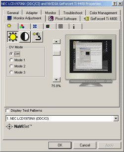
 In comparison with the 1960NXi, the peak brightness is increased by 25cd, the weight is reduced by 500 g (metal stand and frame are replaced by plastic ones), and the depth is increased by three centimeters. The 1970NX has an updated NaviSet version, which allows to control monitor settings right on the Display system panel in Windows. Version 1.0.8 differs from the previous versions by DV Mode support, which consists in three profiles with specific brightness and contrast settings to view video, play games, and work with texts.
TestbedOperating system: Windows XP Professional. Computer is based on Intel P4 2.4MHz CPU, 512MB of RAM, Adaptec SCSI-160 dual-channel controller with SCSI DVD-ROM Pioneer and 18GB 10kRPM hard disks. Video card: NVIDIA Geforce4 Ti-4400 with DVI and TV-IN. Audio: Microsoft Digital Sound System 80 (2.1) connected to Creative SB Live! 1024. Calibrated 19" NEC MultiSync FP950 CRT monitor is installed next to the monitor under review to compare color rendition and response times. Subjective resultsAs usual, the monitor is installed as a regular "wheelhorse" and tested in usual applications. Setting up
Interestingly, NEC changed its standard factory defaults for brightness in the 1970NX. All models with the S-IPS matrix (1960NXi, 1980SXi, 2080UX+, 2180UX) used to be set to 75% (out of 100), but now brightness is set to maximum. In our opinion this setting is not optimal, which can be clearly seen on the LCD HTML test – approximately 15% of grayscale blends with white. But if the brightness is set to the traditional 75%, everything falls into place. Speaking of really comfortable settings, we recommend to set brightness to 50% for a well-lit work place and leave contrast at 50%. It's useless to raise contrast higher than 55-60%, because it will immediately "wash away" the bright half-tones. Unfortunately, this monitor comes shipped without a DVI cable, so we'll carry out all subjective tests in regular "analog" mode. In the menu we disable DV Mode and select the sRGB/6500 temperature.
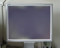
Looking at the displayWe have thoroughly examined image elements in our test background for Windows desktop and the image on the whole. It obviously looked differently, but what was the matter? Perhaps, the overall tone is not warm enough for the 6500K mode. We'll find out later whether it is connected with insufficient red channel or it's "overcome" with blue. But we can say for sure that the grey color is too cold and many halftones are too bright in 100/50 mode. When brightness is reduced to 75%, the image gets livelier, but the color temperature still remains incorrect. Speaking of the HTML test, we rarely see such obvious problems with extreme halftones as demonstrated by the 1970NX at factory defaults: The first 10 bright and the last 10 dark halftones were absolutely indistinguishable. With brightness reduced to 75%, the halftones get slightly better – there appear hardly noticeable differences, for example between 3.3.3 and 5.5.5. But only 50% brightness solves the problem – all halftones except for 1.1.1 and 254.254.254 are quite distinguishable. This situation is noticeably different from the results demonstrated by the 1960NXi. And the 1970NX is no better again.  One cannot ignore the violet hue of the black color (appearing at angled view), when dealing with a monitor on an S-IPS matrix. The 1970NX demonstrated no improvements, but its uniformity of lighting is much worse than in the old 1960NXi – in complete darkness one can see multiple spots all over the screen, which obviously mark backlight locations. Let's try to show this effect. But don't be scared: spotted backlights can be seen only in a completely dark room. Any weak light source in front of the screen – and your eyes will see nothing criminal (absolutely nothing). That's why this effect can be called a feature rather than a bug. At last we are ready to praise the Japanese engineers: unlike the 1960NXi, the 1970NX has no problems with even horizontal lighting of the display bottom (let's put it this way: before Windows task panel). The progress is up to the mark here! WorkingGood old S-IPS in the 1970NX proved once again that no other matrix is better at texts. Scrolling texts and graphics left no trails, though text or small elements lost sharpness. Angles of view are really maximum: one can easily read texts and see a colorful graph even looking almost parallel to the display. Using the 1970NX with texts and Internet content, we had absolutely no desire to disable smooth scrolling or to replace it with a CRT monitor. But we are not going to conceal that the text sharpness leaves much to be desired at the analog connection: symbols cast mild shadow, but this effect disappears in DVI mode. We cannot say it's a critical effect (users won't notice this effect unless they can compare the two connections). Considering the above said, we confidently acknowledge the 1970NX as an office leader. Watching moviesWe shall use DVD movies to evaluate the display:
We use NVIDIA NV-DVD 2.2 DVD-player to play video full screen. Though the differences between DV Mode profiles are not expressly specified, we have quickly found a mode for watching movies (N2). It has the brightest halftones. For example, in Desperado you will see more details in dark episodes compared to other modes. This has no negative effect on the matrix – it still outputs DVD movie fast, practically without diffuseness. The same situation with Star Wars, though the racing episode did not need the increased brightness. As in case of most cartoon DVDs, you couldn't notice whether matrix managed to redraw elements fast enough. Watching concert records, we found no obvious differences from the 1960NXi – the output speed didn't allow to hide visual artifacts due to bad quality of the source material used for this DVD. Though the 2080UX+ was "dirtier". So if you watch low-quality movies, you'd better cleave to monitors with 25ms S-IPS matrix. GamingWe traditionally use Return to Castle Wolfenstein, Episode 2 (outdoor scenes and small closed spaces), for the gaming test. All video settings – to maximum. DV Mode profiles allow more successful fights with the enemy in a dark basement. This will obviously be considered a plus by gloomy DOOM3 fans. And the players of bright FarCry may need the "text" profile, which makes dark halftones more saturated. Dynamically changing fragments are redrawn fast in both games, though theoretically the "gameplay" could have been better. For example, with the 2080UX+. But it looks like the matrix was modified, because many small objects (like tree foliage) now remain sharp even when you move around. You may have already guessed that card movements in Solitaire were visually ideal. We were happy to see practically no trails after the black card backs. Bottom lineThe 1970NX looks like a step towards the price reduction and "averaging" in some respects. It has become more practical in other components. The new features have made it more convenient. But the factory color rendition has become worse and there is still no DVI cable. So, what is the 1970NX? Considering its moderate price, the model looks like a great office monitor or a home display for unfussy users. Objective testsWe cannot finish this review without hardware tests. So, we'll try to compare the 1970NX with the 1960NXi in "digital" mode... Matrix response evaluation
* – factory defaults. The matrix qualifies for the usual formal requirements, having demonstrated a tad less than 25ms in switching from black to white and back. The switch on time is a tad higher than the switch off time, which differs from the results demonstrated by the 1960NXi and 1980SXi. However, the 1970NX is 6ms faster in switching from black to a halftone, 5ms faster in switching from gray to white, and 4ms faster in changing halftones. This is quite an improvement, considering that the matrix seems no faster. Modified parameters of the control unit? But where were such reserves hidden? Smaller spread of dye property changes? Anyway, the 1970NX is half way to the record 16ms S-IPS in the 2080UX+ and leaves far behind the majority of competing 19" models.
Color rendering evaluationWe calibrate the Pantone colorimeter and measure color rendering for the following brightness and contrast settings:
According to OptiCAL graphs, somebody has really messed with color rendition settings. The blue channel correction curve goes noticeably down, which demonstrates excessive brightness of blue hues approximately from 50.50.50 up to 255. The result of applying the calibration profile is illustrative – gray hues acquire the warm gamma, which we initially lacked. The other channels are tuned quite adequately, as in the previous models. At the initial 100% brightness the monitor demonstrates traditionally low 160:1 contrast ratio. But after the calibration it becomes almost 270:1, which is quite acceptable, though almost twice as low as specified. But at comfortable 50% brightness, the contrast ratio is already much higher – 185:1 before the calibration and 950:1 after it. No, there is no mistake here – we have taken over ten readings and this high ratio would always appear at reduced brightness, the borderline value being 60%. Now what concerns our complaints about the bleached halftones on the test background:
Yes, initially the temperature of light halftones falls short of the specified 6500K. However, after the calibration process is completed, the data gets practically ideal. Deja vu. Perhaps, it's high time for NEC to include freeware utilities to help users quickly calibrate their monitors. Final conclusionsNEC seems to have been in a hurry to release its new model before the New Year's Eve. On the one hand, the 1970NX has excellent ergonomics and matrix capacity. On the other hand, its construction and color rendition settings are quite disappointing. The engineers should have paid a little more attention to this product, it's very unlike the respected Nippon Electronics Company. Pros:
Cons:
If you want to get maximum from this excellent monitor, buy a DVI cable and find a calibrator.
Write a comment below. No registration needed!
|
Platform · Video · Multimedia · Mobile · Other || About us & Privacy policy · Twitter · Facebook Copyright © Byrds Research & Publishing, Ltd., 1997–2011. All rights reserved. | ||||||||||||||||||||||||||||||||||||||||||||||||||||||||||||||||||||||||||||||||||||||||||||||||||||||||||||||||||||||||||||||||||||||||||||||||||||||||||||||